
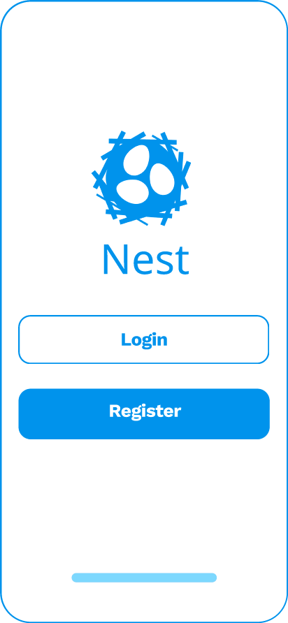
Nest is a transformative group-forming platform aimed at simplifying the process of finding efficient teammates for academic projects. With the ability to create comprehensive profiles, students can showcase their unique attributes and schedules. Nest's intelligent matching algorithm ensures teams are thoughtfully curated for optimal success, while integrated features like group chat messaging and scheduling tools facilitate seamless communication and collaboration. Particularly relevant in the context of remote learning, Nest serves as a vital tool to surmount the challenges presented by online education, enabling students to connect, collaborate, and excel academically in a virtual environment.
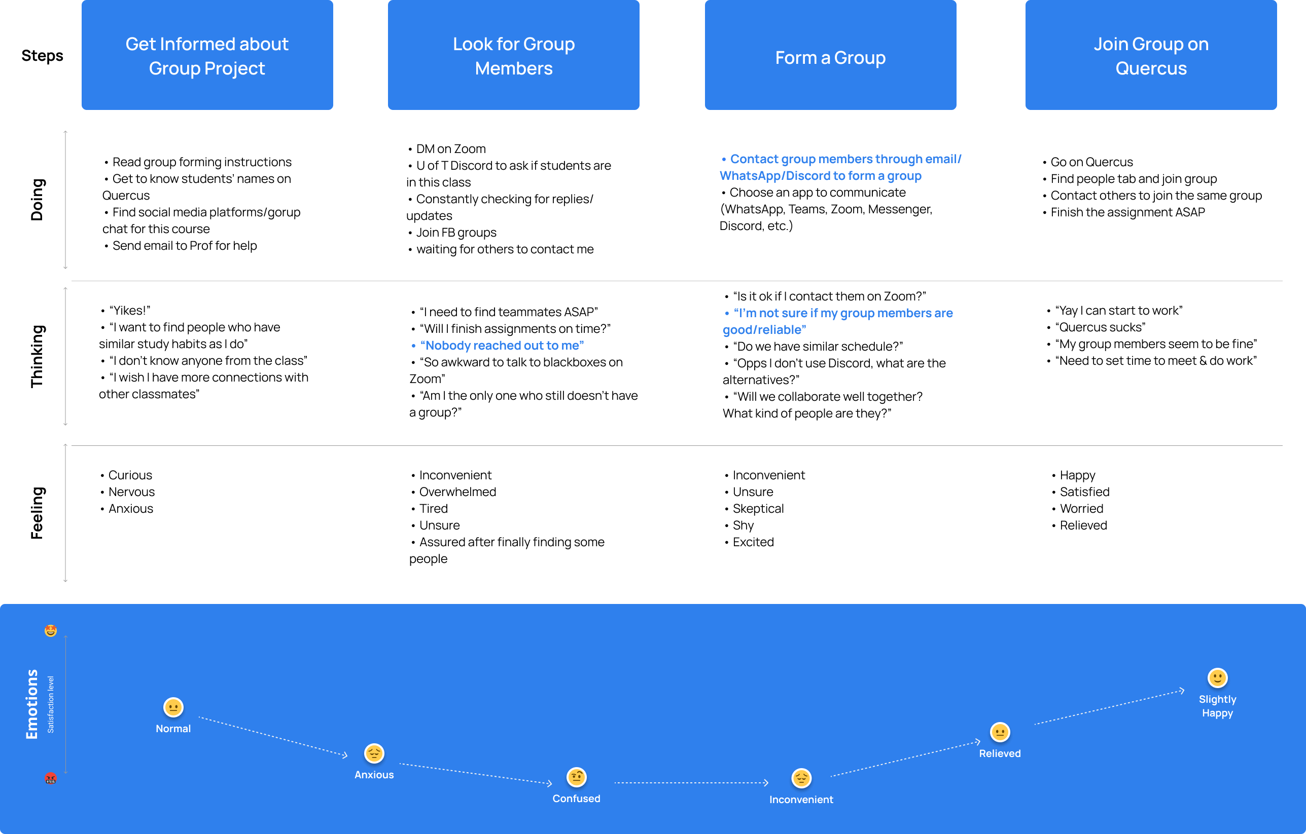
Based on the research results, current students encounter challenges at various stages when attempting to form a group with their peers. The most significant pain points arise during the process of searching for group members and actually creating a group. Students often find it difficult to identify the right individuals to join their team, and they are often troubled by the decision-making process related to the platform or channel to be used for group communication.
In partnership with my team and guided by our research findings, we created the persona of Sandra to represent the typical students who face challenges when forming groups, particularly those who have recently embarked on their university journey and feel overwhelmed by such situations.

a way to understand her classmates so she can find compatible group members
a way to communicate with group members so she does not have to contact group members using multiple apps
a way to find out the schedule of each potential group member so she can better collaborate with the future group
After identifying users' needs and pain points, this is where creativity takes center stage. A range of innovative ideas was put forward, some appearing quite practical, while others may have sounded unconventional. Considering the project's time constraints, we conducted a collective vote on each idea, evaluating them based on their feasibility and potential impact. This process helped illuminate the way forward for our next design phase and provided guidance on the direction to pursue.

Among the proposed solutions, two practical options garnered the highest number of votes, with each of them serving as a thoughtful remedy for the needs identified earlier.


In addition to the practical ideas that were confirmed for design, there was some debate within the team regarding the fundamental communication mode for users to engage with the application.
I conceptualized a "Blind Date" swiping interaction, allowing students to browse potential matches for their teammates. This concept drew inspiration from popular dating apps widely used today.
I believed that in the context of finding the "right" teammate, the process closely resembled the situation when people are searching for the "perfect" date. Furthermore, the swiping interaction was simple and efficient, providing students with essential information to decide whether to match with a suggested candidate or not.
Working together with my team, we developed a storyboard featuring sketched screens to illustrate the user flows within the application. The tasks depicted in the storyboard encompass the onboarding process, matching with potential candidates, engaging in group chat, and checking group members' time availability.

In order to gain a deeper insight into how the ideas and the application were addressing students' pain points, we carried out a lean evaluation with the low-fidelity prototype. This process allowed us to collect real-time feedback about our efforts, and the results proved to be enlightening. We identified numerous potential enhancements to incorporate into our prototype.

Taking into account the insights derived from the lean evaluation, we revamped the mid-fi prototype to make it more thoughtful and logically sound. This involved refining the interfaces for improved clarity and streamlining task flows to ensure a smoother user experience.
TRY FULL PROTOTYPE
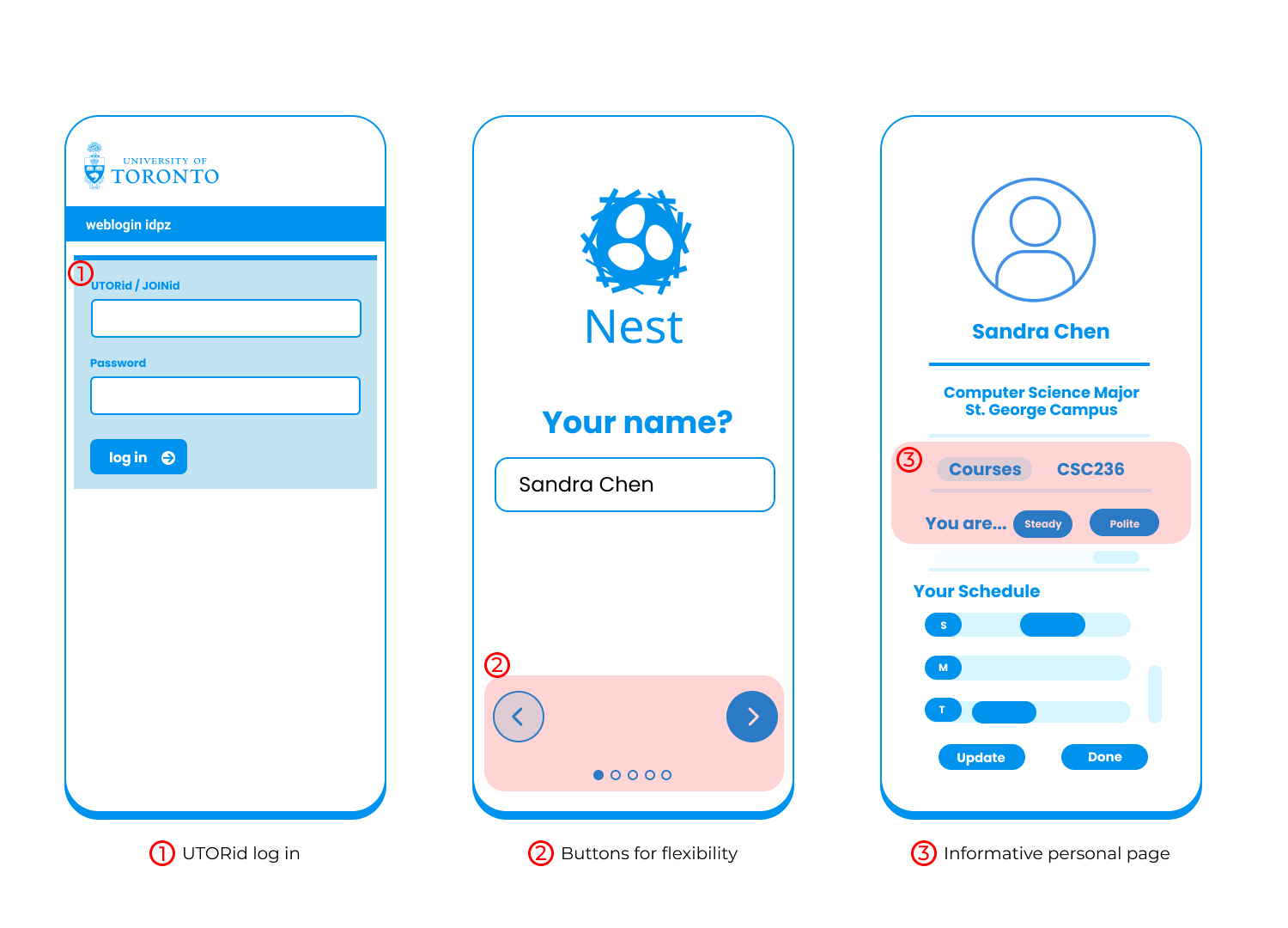
Given that the application is tailored to the U of T context, we opted to streamline the onboarding process, making it more user-friendly for UTers that students can now conveniently log in using UTid.
To enhance the onboarding experience, we introduced back and forward buttons on the onboarding pages, providing users with more flexibility throughout the process. Additionally, progress dots below indicate the number of steps in the onboarding process.
The personal bio page has been revamped to offer more comprehensive information, and students can easily edit their details using the "Update" button.
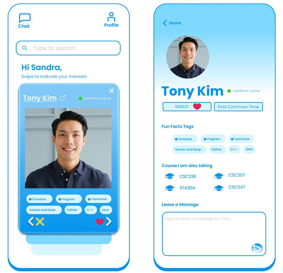
Addressing user complaints about the search function being unclear, we implemented a prompt for the search bar to guide users.
Additionally, common hashtags are now highlighted for improved visibility. To enhance intuitiveness, we replaced the plus button with "Form Group", making the action more straightforward.

The button enabling users to find the most suitable meeting time has been rephrased for simplicity and ease of understanding. Various values now indicate the number of group members available for each time slot. Users can access detailed information for each optimal time by clicking the button.

Despite upgrading the prototype to address the flaws identified during the lean evaluation, the results of the usability testing did not meet our expectations. The average task completion rate stood at only 47%, with nearly 65.4% of participants giving up or leaving during the first task. The primary issue appeared to be related to the design of the "Search Bar" on the homepage, as it was positioned at the bottom, which contradicted users' common expectations and heuristics.
"Where is the search bar? It's hard to notice it!"

Furthermore, the misclick rate recorded through Maze offered valuable insights, prompting me to reevaluate the layout and visual presentation of buttons. In Task 2, the misclick rate reached 45%, suggesting that users might have been uncertain about how to navigate the home page and the intended functions of each designed button. As a result, we will explore further enhancements in button design to alleviate user confusion and enhance the overall user experience.
"I thought the upward arrow means the previous one since the downward arrow means the next."
.png)
As a UX designer, I consider innovation and creativity to be crucial attributes in achieving my goals. In this project, I must admit that I had doubts about whether the "Dating App Swiping" function was the optimal choice. I encountered some opposing views within the team, which left me feeling frustrated. However, I'm pleased that I had the courage to stand up for my idea and eventually gained the support of my teammates. Notably, the idea received positive feedback from our users and other stakeholders.
This experience has taught me that as a designer, it's essential to be daring in thinking outside the box. It's natural to encounter differing opinions, but by making a compelling case and convincing others, you may find pleasant surprises waiting in the end.
The outcomes of the second round of usability testing caught me by surprise because I had believed that the product had been well-refined based on the insights from the lean evaluation. However, the low task completion rate and high misclick rate underscore a critical reality: the product still falls short of expectations. In particular, the buttons and interface layout we had designed did not deliver a positive user experience but instead caused confusion among users. While I had perceived the designs as straightforward and user-friendly, it was apparent that users did not share the same perspective.
I aimed to assist users with their needs as a UX designer, but I felt that I had fallen short in this regard. This experience serves as a valuable lesson for me in further honing my user-centric design thinking. It emphasizes the importance of prioritizing users' needs and understanding that what users find valuable is the ultimate objective.